

Zwift Onboard Experience Update
As the Sr. Product Design Manager, I led the UX strategy aligning design solutions with business objectives.
Overview
Background
Zwift was facing a significant challenge: new users struggled to get started. The onboarding process had significant drop-off points, from confusion about how Zwift worked to difficulties setting up hardware.
My goal as the Product Designer was to lead the UX redesign, collaborating with a UX researcher and UI designer to deliver an intuitive, seamless onboarding experience that solved real user problems.
Problem Context
Zwift’s onboarding experience struggled to convert new users into active riders. User feedback revealed key pain points:
Confusion about Zwift’s purpose (app, game, or training platform).
Overwhelming setup process with unclear instructions for hardware and software pairing.
Frustration with redundant and disjointed steps between web and app onboarding.
Outcome Goal:
Increase onboarding completion rates by 25%.
Improve activation rates (first ride within 24 hours) by 15%.
Reduce early churn by addressing major user pain points identified during research.
Discovery
We needed to understand where users were struggling and why they dropped off, We started with an in-depth discovery phase. I worked closely with our UX researcher to collect and analyze data. We worked with product management on competitive benchmarking.
We conducted moderated interviews with new and churned users, usability tests of the existing flow, and surveys of over 500 users. Additionally, I collaborated with the CS team to dig into customer support logs.
-
Objective: Understand first-time users’ expectations and experiences with Zwift, from account creation to completing their first ride.
Approach:
Conducted 11 moderated interviews with a mix of new and recently churned users.
Focused on understanding motivations, setup challenges, and perceptions of Zwift's value proposition.
Key Insights:
Misaligned Expectations: Many users assumed Zwift was a hardware company or compared it to Peloton, expecting live coaching or classes.
Quote: “I thought Zwift came with its own bike, like Peloton. I didn’t realize I needed extra equipment.”
Frustration with Device Pairing: Users found pairing their trainers and sensors confusing due to inconsistent terminology and limited guidance.
Quote: “I spent 30 minutes trying to pair my trainer and gave up.”
Unclear Next Steps: Users reported feeling unsure of what to do after signing up, with some abandoning the process altogether.
Quote: “After I signed up, I didn’t know how to start riding—it felt like I was dropped into a confusing app.”text goes here
-
Objective: Identify specific friction points in Zwift’s onboarding process.
Approach:
Observed users completing the onboarding flow via screen share.
Measured time to completion, error rates, and user sentiment.
Findings:
Redundant Steps: Users were frustrated by having to enter the same information on both the web and mobile app.
Example: Account setup on the web required a fitness profile that was later requested again in the app.
Unintuitive Navigation: Users struggled to find key setup steps, such as device pairing or ride tutorials, within the app.
Observation: Participants frequently returned to the homepage, unsure of where to go next.
Drop-Off at Pairing: 40% of participants abandoned the process during hardware pairing, citing unclear instructions or lack of feedback when devices failed to connect.
-
Objective: Benchmark Zwift’s onboarding process against industry leaders in fitness apps and platforms.
Approach:
Analyzed onboarding flows of Peloton, TrainerRoad, and MyFitnessPal, focusing on clarity, guidance, and feature introduction.
Findings:
Peloton: Excelled at communicating its value proposition upfront and providing guided setup with visuals.
Takeaway: Zwift needed clearer messaging to differentiate itself and showcase its unique features.
TrainerRoad: Provided step-by-step guidance for device pairing, reducing friction for new users.
Takeaway: A step-by-step device pairing wizard could address Zwift’s pairing challenges.
MyFitnessPal: Personalization during onboarding (e.g., fitness goals, preferences) made the app feel tailored to users.
Takeaway: Personalizing Zwift’s onboarding to align with user goals could improve engagement.
-
Objective: Quantify user pain points and validate qualitative findings.
Approach:
Distributed a survey to 500 users, including both active and churned customers.
Questions focused on the ease of onboarding, perceived value, and reasons for drop-off.
Findings:
Setup Challenges Dominated Churn Reasons:
65% of churned users cited setup difficulties as their primary reason for leaving.
Survey Comment: “It was too hard to figure out what equipment I needed and how to set it up.”
Desire for Guided Assistance:
78% of respondents wanted step-by-step instructions for setting up and starting a ride.
Low Understanding of Zwift’s Value:
Only 45% of respondents understood Zwift’s purpose during their first interaction.
-
Objective: Identify recurring issues reported by new users.
Approach:
Reviewed over 1,000 support tickets and FAQs related to onboarding and setup.
Findings:
Top Support Requests:
How to pair devices.
How to start a ride.
Clarification on required equipment.
Recurring Themes:
Lack of real-time feedback during device pairing (e.g., no confirmation when devices connect).
Confusion about the differences between Zwift’s app and web platform.
Research Synthesis
Aligning the Team Around User Needs
This journey served as a shared reference point for the entire team, keeping us aligned on the user’s perspective. It grounded every design and development decision in the reality of how users experience Zwift, ensuring that we didn’t lose sight of the end goal: making their journey as seamless and rewarding as possible.
Identifying Gaps in the Experience
The journey revealed critical disconnects, such as confusion between Zwift’s main app and the Companion app or uncertainty around hardware compatibility. These gaps became clear areas to address, providing focus for our design process.

Priority Design Opportunities:
Unclear Next Steps: Users were unsure how to move from signing up to starting their first ride.
Hardware Confusion: Users had difficulty figuring out what equipment they needed and how to connect it.
Overwhelming Interface: Many felt the multiple apps (Zwift and Zwift Companion) and steps were unnecessary and confusing.
High-level Findings:
Many users didn’t fully understand Zwift’s purpose and thought it was a hardware company.
Device pairing was a major hurdle, with unclear terminology and no real-time feedback.
Redundant steps between the web and app platforms frustrated users.


Design Iteration
After conducting in-depth research and identifying key friction points, the team developed a comprehensive cross-platform user journey that unified the Zwift app, Zwift Companion, and web experiences. This journey mapped every interaction a user would have, from initial discovery through retention, ensuring consistency and seamless transitions between platforms.
It prioritized resolving pain points—like setup complexity and disconnected experiences—while aligning all touchpoints with Zwift’s core value proposition and user goals. This comprehensive journey served as the foundation for designing solutions that enhanced clarity, usability, and engagement across all platforms.
Web Updates
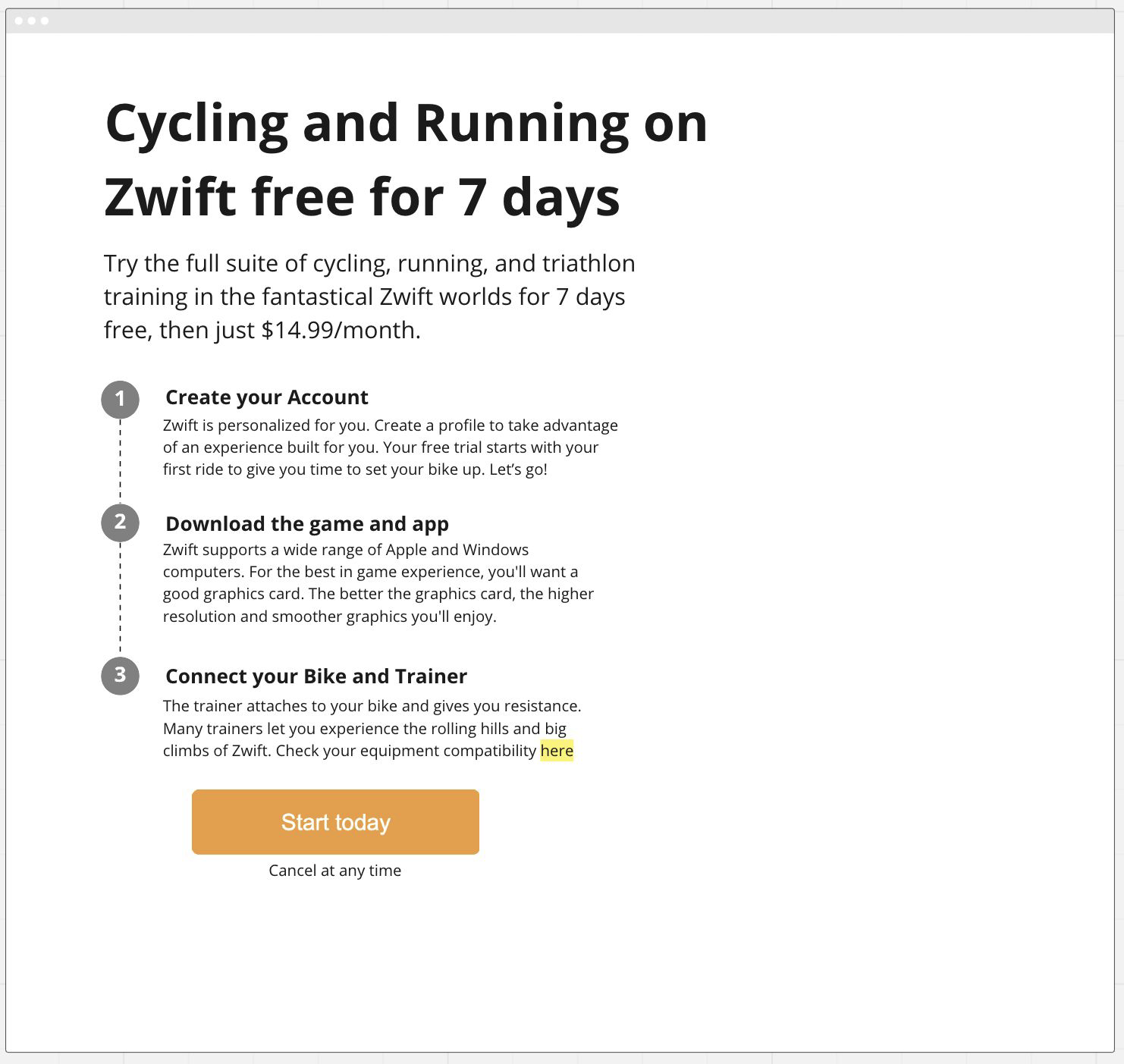
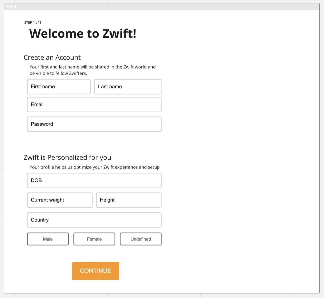
Redesigning the Zwift website to better support onboarding by providing clear pre-signup information, equipment recommendations, and guidance for new users
Key Deliverables: Streamlined sign-up process with goal-oriented prompts.
Initial Wireframes


Team UI Exploration


Equipment setup
Simplifying the hardware pairing process to ensure users can set up their smart trainers, sensors, and devices effortlessl
Key Deliverables: Dynamic setup guides tailored to specific hardware.
Wireframe Brainstorming

Team UI Exploration


In game Profile
Enhancing the in-game onboarding flow to introduce Zwift’s features and core value propositions in an engaging and non-overwhelming way.
Key Deliverables: A structured first ride experience personalized to user goals.
Wireframe Brainstorming

Team UI Exploration


REsults
After implementation, we tracked the impact of the new onboarding experience:
+30% increase in onboarding completion rates.
+20% improvement in first-ride activation within 24 hours.
40% fewer support tickets related to setup challenges.
User feedback was overwhelmingly positive, with 85% of surveyed users describing the new flow as “intuitive” and “helpful.”
Qualitative Feedback:
"The setup was so simple—I was riding in minutes!"
"I finally understood how Zwift works without feeling lost."